Sanlo's pivot
Overview
Sanlo, a series A startup, provides a suite of monetization tools tailored for mobile gaming companies, offering financial and e-commerce solutions through their platform.
My Role
◆ Research
◆ Product design
◆ Prototyping
◆ Usability testing
Team
◆ Product Manager
◆ Front-end Engineers
◆ Back-end Engineers
◆ Part-time Jr. Designer
Limitations
◆ Limited resources
◆ Established visual design
Problems to solve
Sanlo's platform was underperforming, with usability issues and lacked popular features.
Business Objective
Rapidly add product offerings while improving the user experience to win new customers.
Process
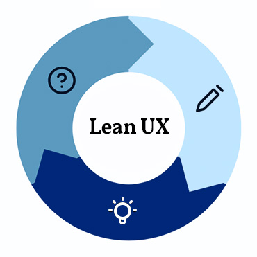
As a small startup with limited resources, we adopted a lean design process, incorporating user research, AI-assisted data analysis, collaborative brainstorming, targeted concept testing, and agile development.
Research
Dive into Sanlo's domain, understand the market. Review existing research to avoid redundant studies. Determine the experience, features, and improvements users want the most. Leverage AI to enhance and scale our research data analysis.
User interviews & surveys
◆ 8 new interviews
◆ 34 new surveys

Competitive analysis
◆ 3 Ecommerce platforms
◆ 3 page builders

Market research
◆ 5 front-end webshops
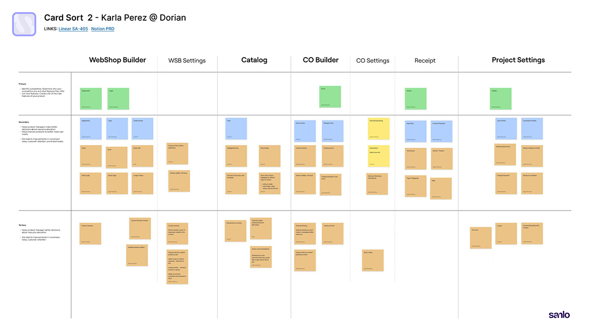
Card Sorting
Conducted sessions with 3 users to help us understand their mental models.
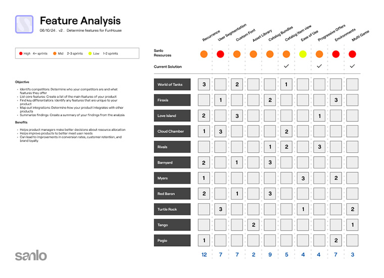
Feature Analysis
14 studios ranked their most desired features via online survey.
Learnings
Below are the key insights and takeaways that emerged from our analysis.
◆ Users want simplicity and intuitive navigation
◆ More control and options for items
◆ Our platform faced challenges in usability
◆ A better process for reviewing builds
◆ Need for more visual design features
Goal alignment and priorization
We prioritized our work by aligning user goals with available resources.
◆ Improve the overall architecture, adding dev environments
◆ Create a stand alone check-out and receipt builder
◆ Improvements for item management
◆ Custom font feature for more visual design control
◆ Extract the financial product as a standalone application.
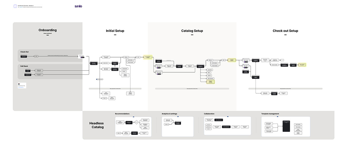
Architecture and flow adjustments
Adjustments needed to be made to the platforms architecture to account for the new check out product, the addition of environments, and the ability to navigate multiple projects.
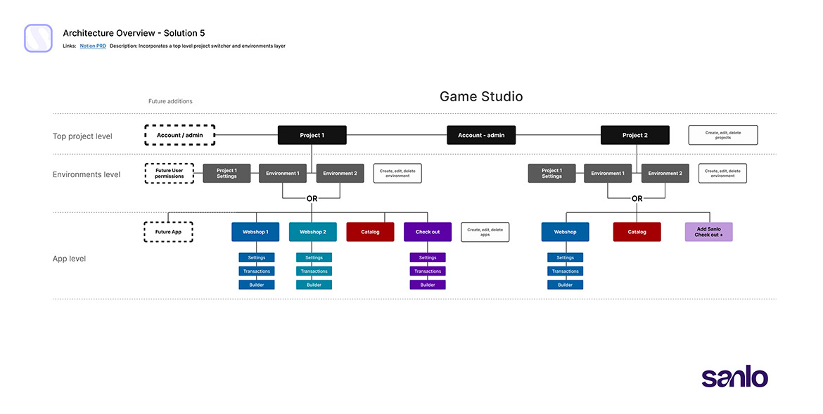
User flows needed adjusting to accommodate the new products and architecture as well.
Ideation Testing & Usability Studies
Moving fast we did concept and usability testing with low fidelity layouts and prototypes. Below are 3 of the 5 tests we performed with users representing our target demographics.
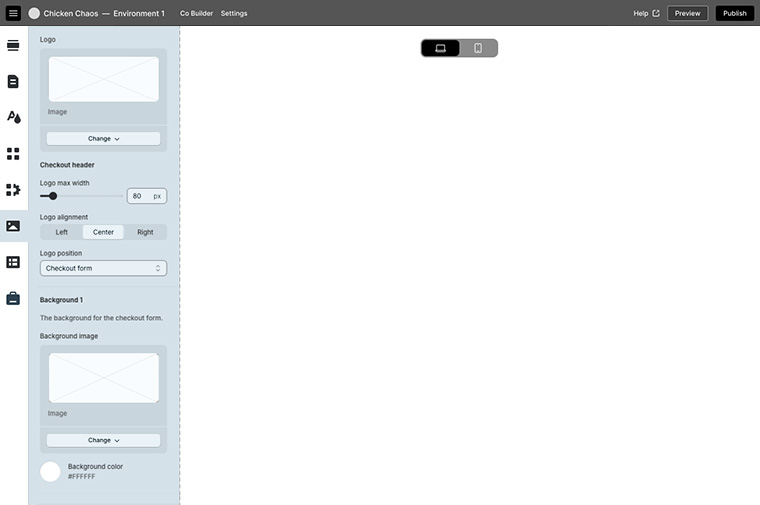
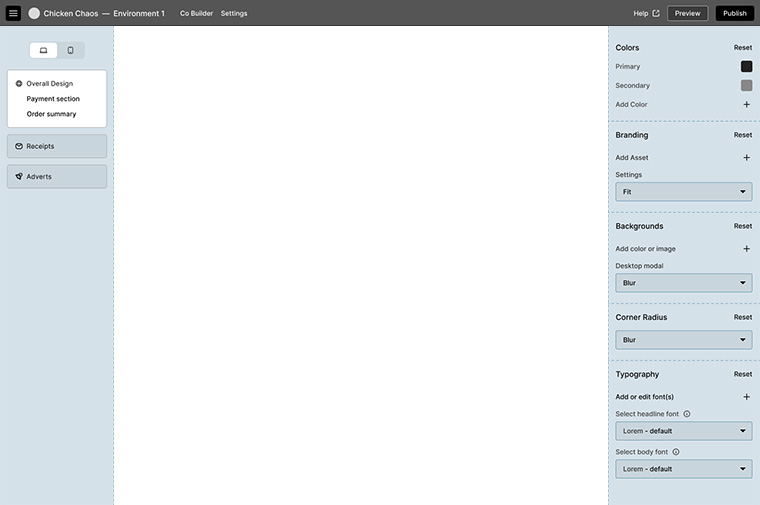
1. Check Out Builder layout study
◆ A left panel design using icons. View port toggle centered on canvas.
◆ Dual panel design, using the left panel to control the tools in the right.
Results: Icon design would require more design and testing. A centered canvas was generally preferred.
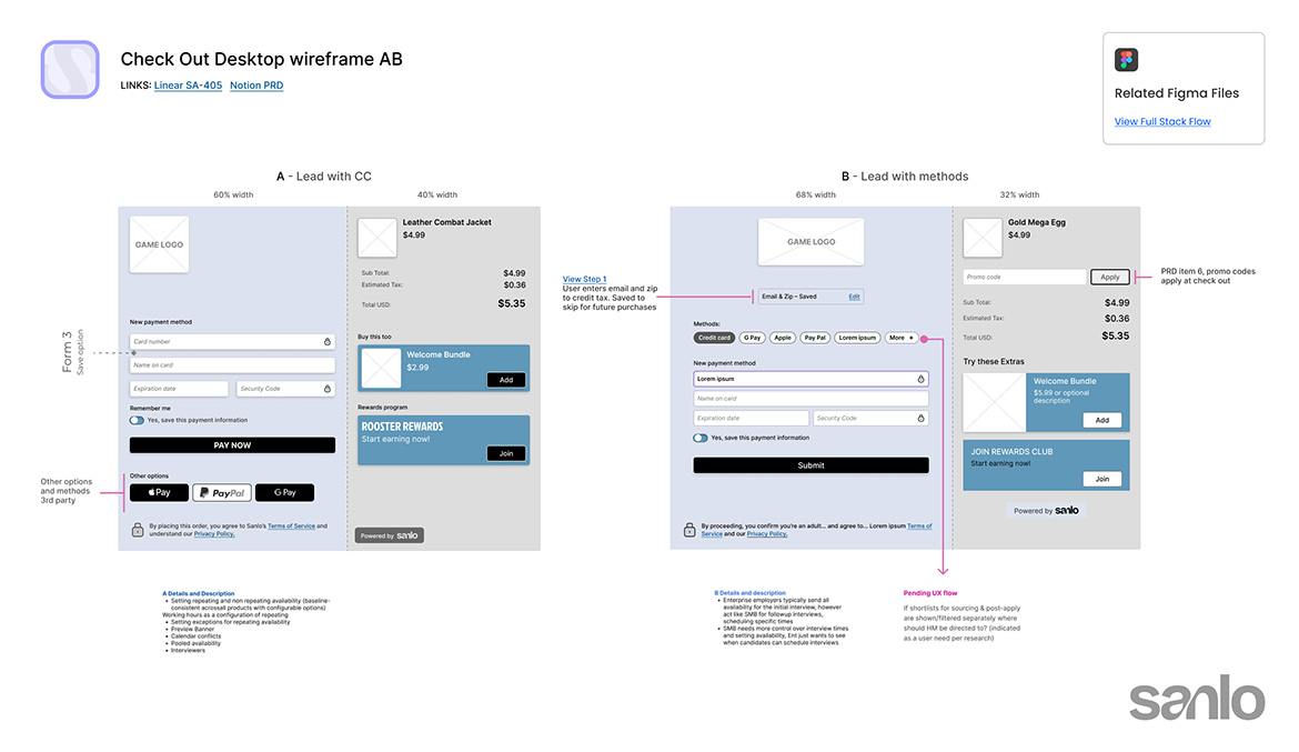
2. Front end Check Out
◆ Layout and flow that prioritized the more popular credit card method.
◆ Grouped the methods together and a different flow for first-time customers.
Results: Grouping payment methods together provided clearer choices. The separate flow for first-time customers helped guide them through the experience more intuitively.
3. Adding custom fonts
◆ We compared designs with various amounts of typography features.
Results: Users were split, so we moved forward with the easier concept to engineer.

Challenges
Unexpected issues that arose during the design process
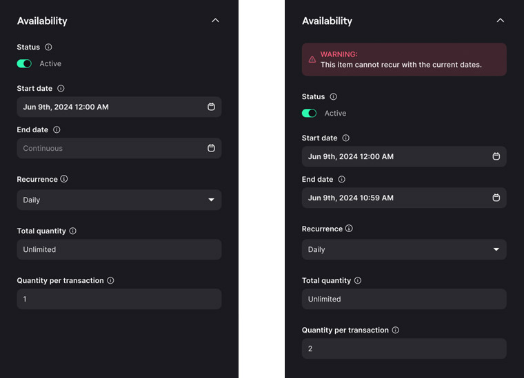
Breaking recurrence
Combining availability dates with recurrence options could prevent items from appearing. Due to limited engineering resources, we implemented a temporary UX solution.
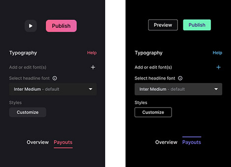
Color Adjustments
The established visual design had accessibility issues, with low contrast and used the same soft red for primary buttons, delete actions, and active states.
Visual Designs
Here are some of the visuals, showcasing both the backend builder interface and the front-end consumer-facing designs
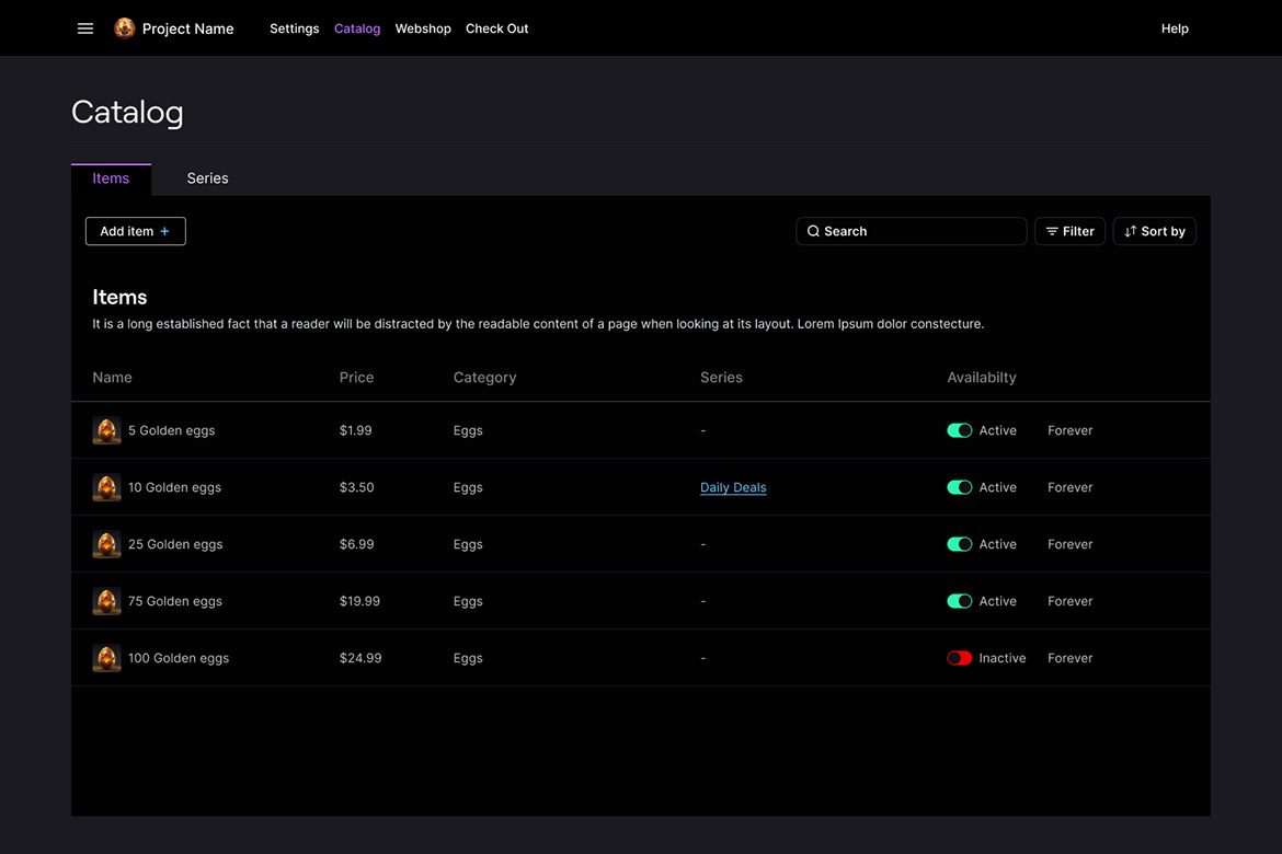
Redesigned Catalog with new Series tab

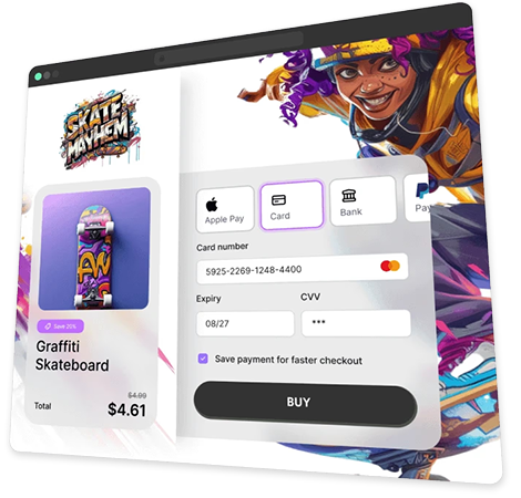
Front end check-out proof of concept
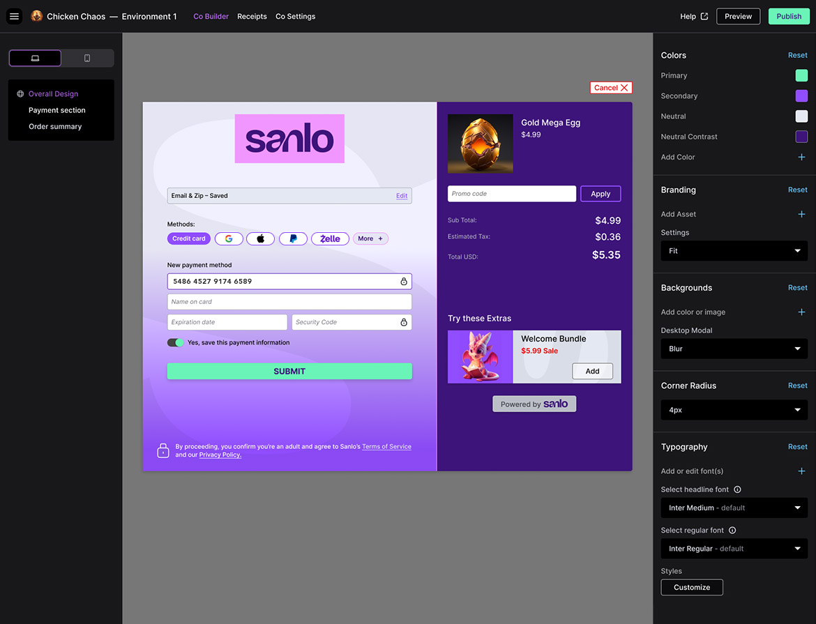
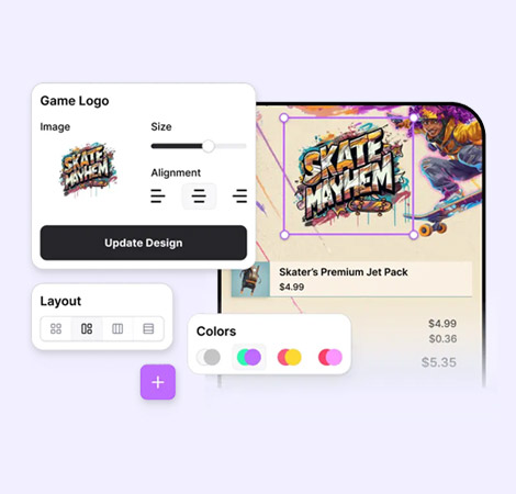
Check Out Builder with placeholder graphics
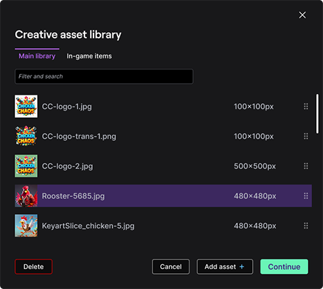
Universal module component
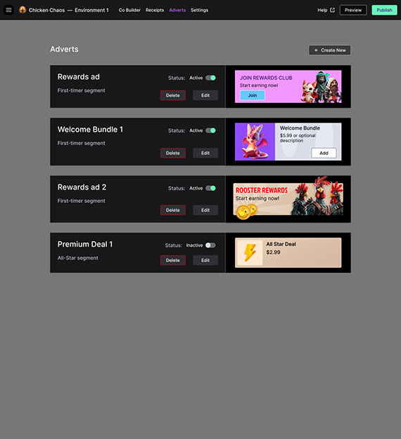
Adverts builder concept
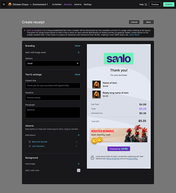
Receipt Builder
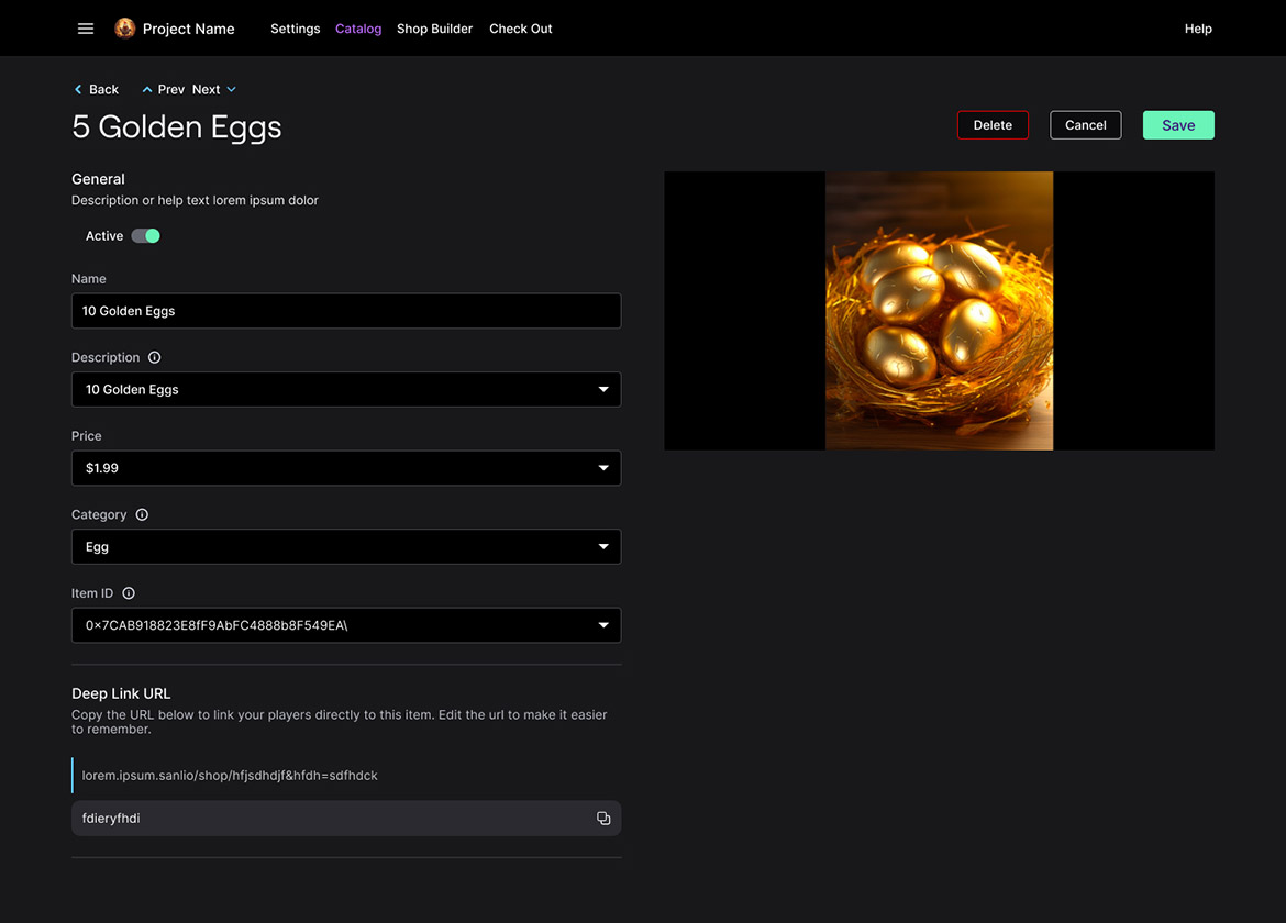
Catalog item view
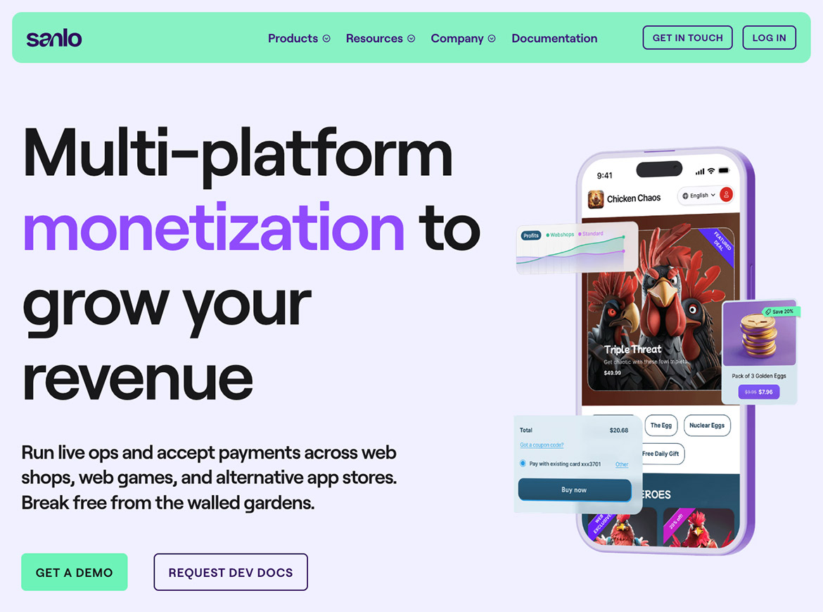
Marketing website AI assisted brand update
Conclusion
Through these efforts, we created a scalable platform and more intuitive user experience that met the immediate needs of the business. Adding features that improved user satisfaction and quickly increased revenue.
25%
Increase in Revenue