UPS Mobile Delivery
Overview
I evaluated the user experience of UPS’ Mobile Delivery App which over 345,000 full-time and seasonal drivers use daily to deliver millions of packages around the world.
The goals for this study included identifying opportunities to improve usability, intuitiveness and gathering recommendations to enhance the overall user experience.
Research: The user experience audit
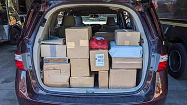
To gather a deep understanding of the existing app, I used it to deliver several hundred packages over the course of a month. This hands-on evaluation enabled me to experience a wide range of functions and identify specific usability issues.
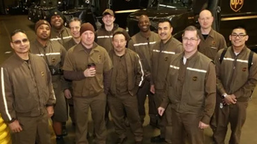
I then conducted contextual inquiries and in-depth user interviews of full-time and seasonal employees. I also conducted an online survey of drivers across the county, gaining valuable insights into the unique challenges faced by drivers in different environments, such as city drivers vs. suburban.
Problems and issues uncovered
Clutter
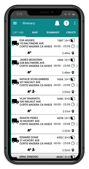
Accumulated features led to a cluttered interface, hindering user experience.
Inconsistency
I found different design elements and patterns throughout the application.
Visual Hierarchy
Some elements were not laid out in a way that showed the user the order of importance.
Architecture
During my research, I discovered a concerning pattern of navigation errors and difficulty for new users in locating specific functions, even after repeated use.
Opportunities Discovered
I made sure the following solutions had a clear understanding of users’ goals and took into account the different level of resources that would be needed to make any adjustments. Overall I wanted to prioritize the information users found essential, by limiting options and giving a strong information scent on an uncluttered display.
Information Architecture
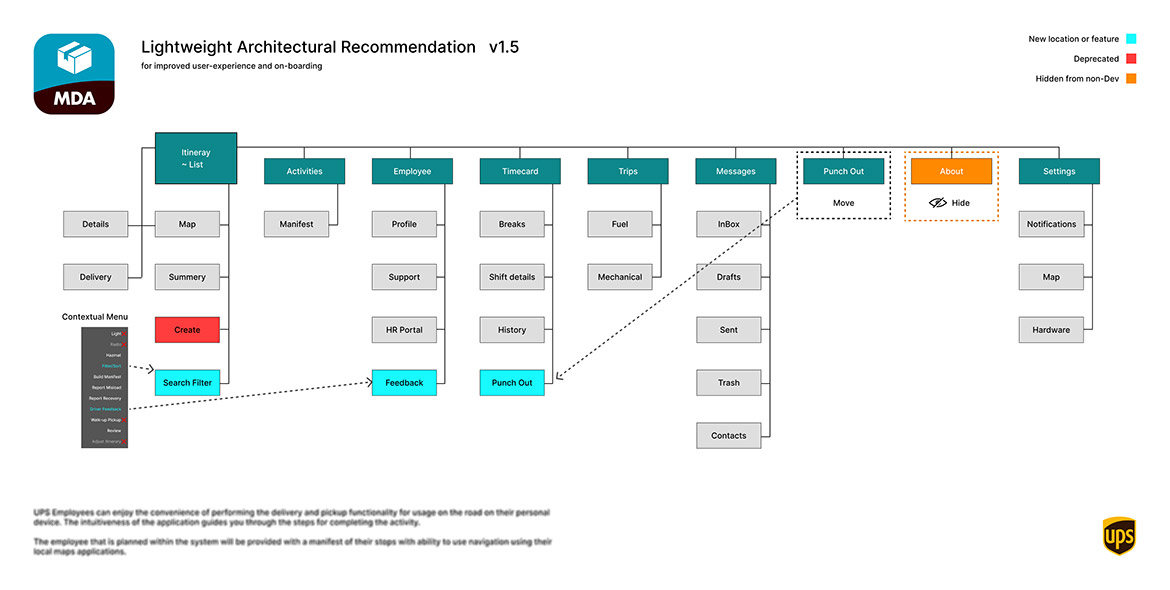
UPS was guilty of stuffing their app full of features that the majority of their users didn't need, was in the wrong place, or was a deprecated feature. Knowing changes to an established application's architecture would be resource intensive, I only recommended a few changes, seen above, that would have the greatest improvement to the product's usability.
Concept testing
To evaluate potential solutions for the top problems uncovered during research, I conducted surveys with real users. This allowed me to assess the effectiveness and appeal of my design concepts before moving forward. Below are the results.
Current Design
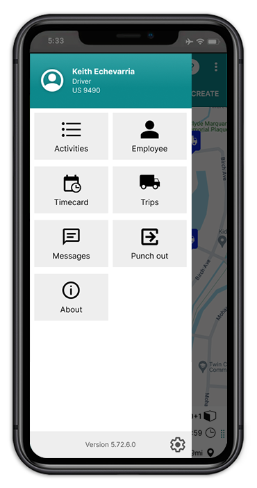
Menu Adjustments
The profile icon, located in the top left, serves no purpose. Removing it and converting the navigation items to a list makes it easier to scan and reduces the user's cognitive load.
Recommended adjustments to the apps architecture allows us to merge Punch Out into Timecard, along with a more logical location for Help and Settings.
New Design
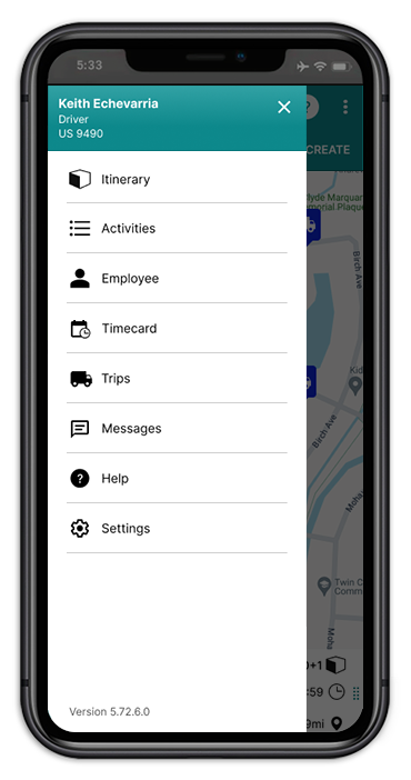
Preference differential
+20%
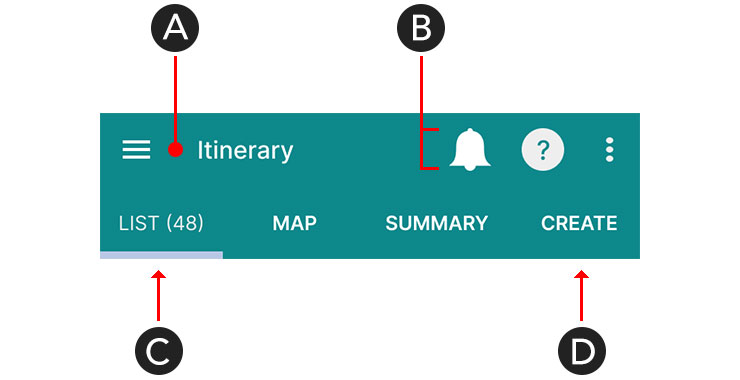
Nav-bar Adjustments
A. Reducing this space allows for more negative space between UI groups.
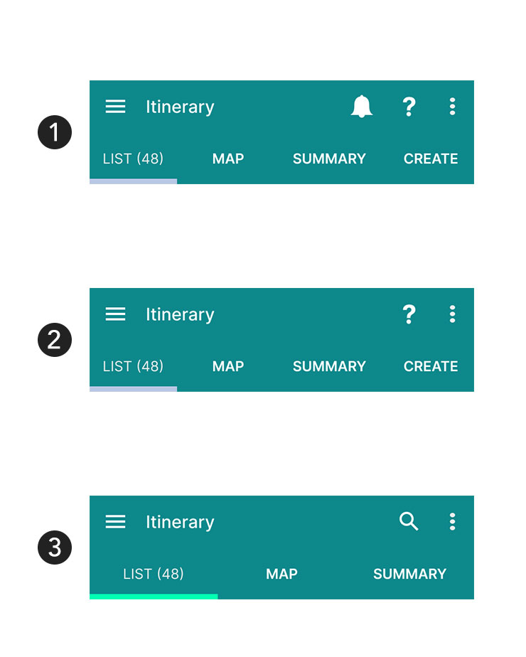
B. Size reduction of icons and a consistent height, as seen in #1, helps reduce clutter. Then, we hide the bell icon when there are no new messages, as seen in #2.
C. The current tab color gets lost. App-wide adjustments create more contrast, see #3.
D. Architecture adjustments, moves Help and eliminates the Create tab, allowing us to bring out a, user requested, search function.
Preference differential
+40%
Current Design
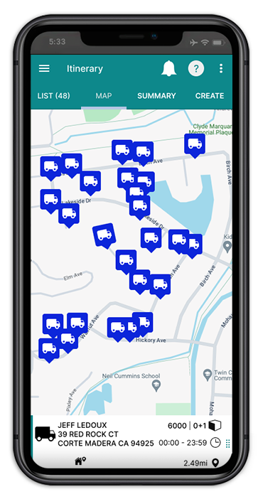
Map Adjustments
Due to turnover on the Design Team, the purpose of the large truck icon, as a map pin, has been lost. Veteran drivers find it confusing. Once they've memorized their route, they rarely use this app feature.
In most cases, icons aren't the place to be creative. If we swap out the bulky icon for simple dots we can reduce anxiety, save screen real estate and enhance aesthetics.
New Design
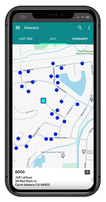
Preference differential
+400%
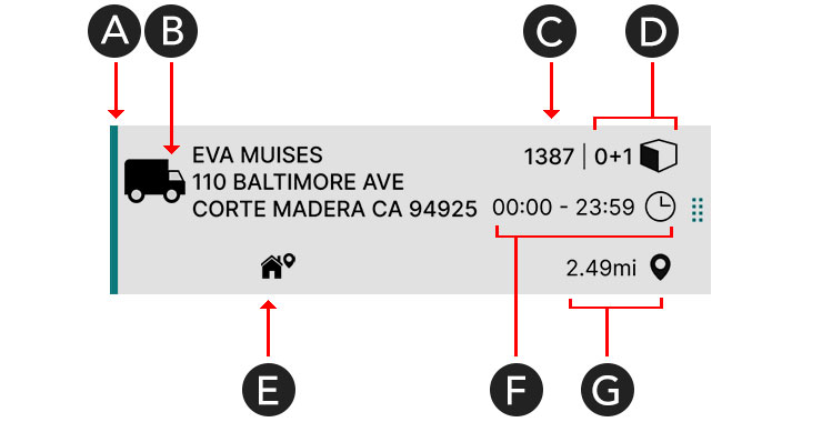
Delivery Card Clutter
A. This colored line indicates a function that no longer exists.
B. This icon takes up too much space and its meaning has become redundant.
C. This number is the first thing drivers look for and should be more predominant.
D. This representation of the # of packages can be minimized.
E & F. These icons only need to appear when a package has a special condition.
G. No user indicated they need this info.

Preference differental
+1000%
Current Design

Delivery List Adjustments
Applying my information architecture and user interface recommendations creates both visual and functional improvements.
Streamlining complex interfaces is vital for user comprehension and satisfaction.
New Design
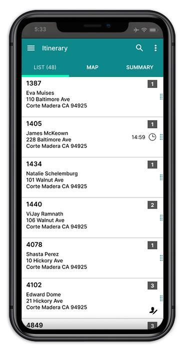
Preference differential
+1000%
Current Design
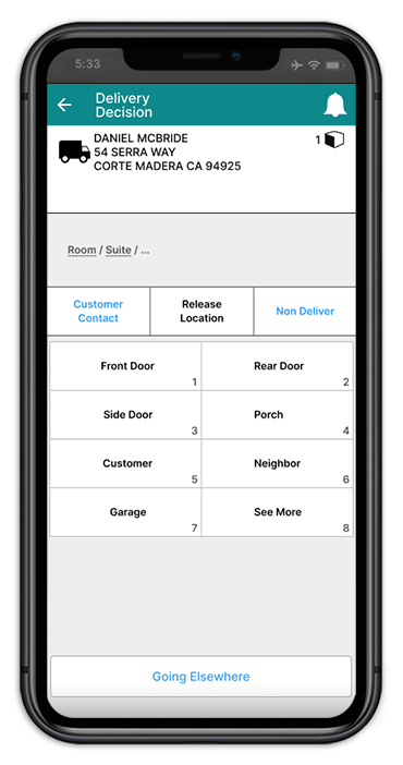
Outdated UI Patterns
Note the breadcrumb navigation, research revealed this was a legacy item for users on foot delivering to suite's in a large building and not needed by drivers.
The tabs presented here are inconsistent with those presented in other parts of the app.
The 1-8 choice chips look the same as the tabs above and resemble the button below.
New Design
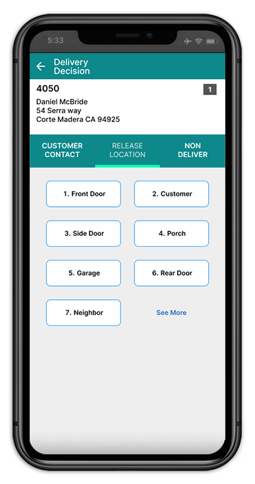
Preference differential
+200%
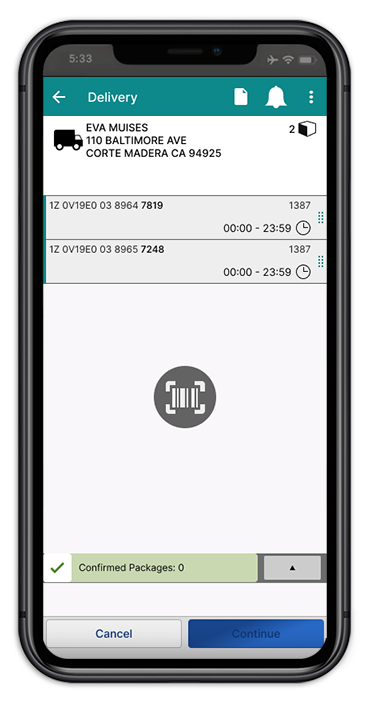
Consistency
Note the "Confirmed Packages" accordion. In a rush to push this feature live, these elements were given rounded corners and odd spacing not found elsewhere in the app.
The blue Continue button is displaying its disabled state, a confusing design for most new users.
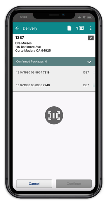
Preference differental
+40%
Conclusion
After gathering and analyzing user feedback, observing workflows, and testing my ideas and concepts, I formulated a comprehensive report detailing these findings. In my presentation to UPS stakeholders, I highlighted the critical areas that were affecting driver efficiency and satisfaction, providing clear, actionable recommendations for enhancing the app's functionality. I emphasized how addressing these issues would not only improve the user experience but also increase overall productivity. The stakeholders recognized the potential for improvement and plan on implementing several changes based on my recommendations.